WE-Project
WE-Project
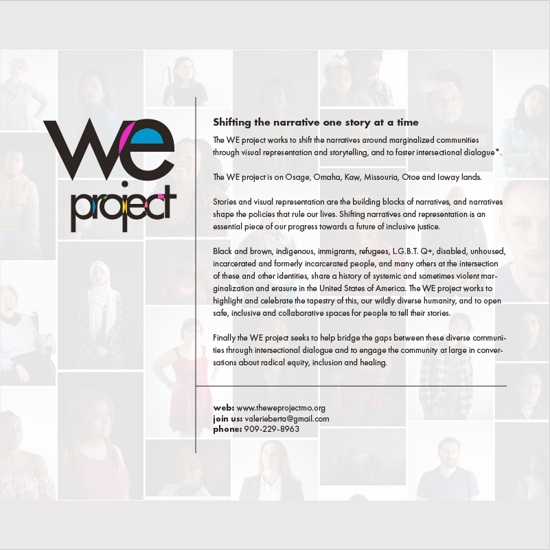
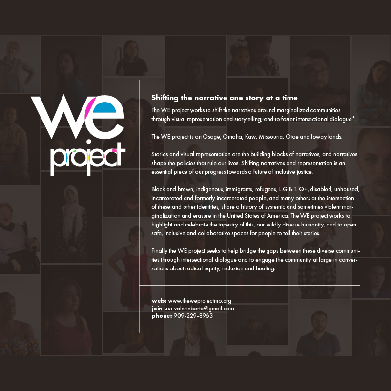
" The WE project works to shift the narratives around marginalized communities through visual representation and storytelling, and to foster intersectional dialogue."

//overview
We were commissioned to develop this corporate identity for an ongoing diversity project by a well known photographer in Columbia, MO. The project's main purpose focused on narratives around marginalized communities through visual representation and storytelling, and to foster intersectional dialogue. Rather than use a standard rainbow colors, a more soothing and approachable pastel color scheme was implemented, with a dark, melinated, and warm base tone. Printed cards we needed, as well as web versions to keep costs low.
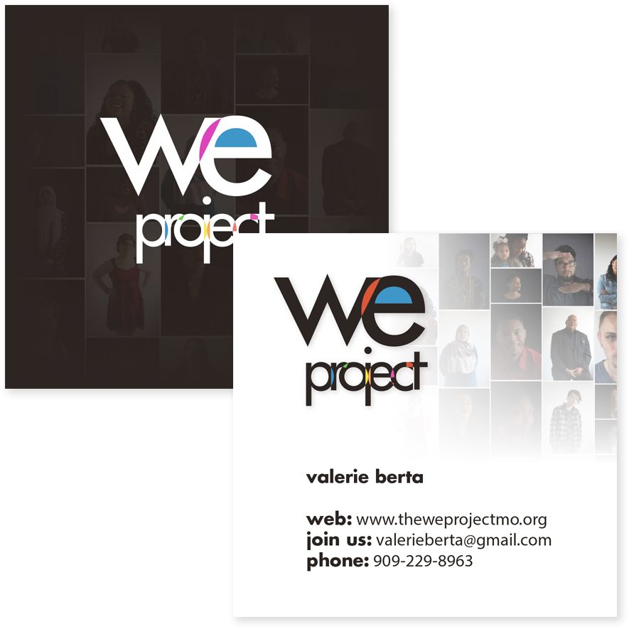
We Projects Business Cards
We opted for nontradtional square cards to make them stand out.
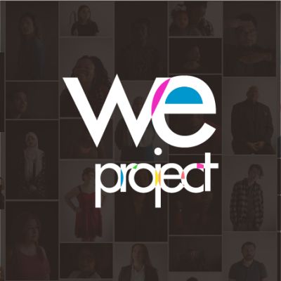
Mission Statement - Instagram